Graphic Design 1: Week 7

For the magazine spread, I had decided to go outside of the box and make my own topic.

Headline: House of McQueen; Post-McQueen

Deck: After the death of the legendary designer, the house’s fashions has remained relatively the same. Or have they?

Byline: by Garrett Griggs

Objective: Design a two spread feature story briefly revisiting McQueen as a designer, explaining his death, and introducing his replacement. How have the styles been the same and/or different? Are they from his previous sketches? Are they created in a new designers’ mind? What happens when the head designer of their own house passes or steps down and leaves their fashions

Graphic Design 1: Week 6

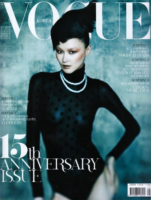
The Didot typeface is expensive, neoclassical, and evocative. It is a modern typeface classification, or specifically as Didone. Firmin and Pierre Didot, French typeface designers who were brothers, developed the typeface throughout 1784 – 1811. It’s purpose since its creation was to be used in marketing ploys, and evolved to be used strictly in fashion magazines today.

Graphic Design 1: Week 5

Didot’s typeface personality is described as expensive, sleek, and sophisticated. The thinner the more expensive, whereas the thicker, the more cheap looking. This typeface’s personality is evident in high fashion, as it is also very expensive, both literally and figuratively.